Where the Warmth Lives: How Two Traditions Measured the Turn from Summer to Autumn
Essay
Autumn does not make the light warmer. Measured region by region, two canvases of the same field show the sky staying where it was while the ground swings seventeen points warm, and the shadows, all summer filled with blue skylight, turn into the warmest passages in the picture. With three pastels in which the medium is held still and only the season moves. And a second half in which autumn is not a light at all: a calendar that declares it on the seventh of August, a season carried by one grass, and a moon with no horizon to rise from.
Viacheslav Munister · 2026-08-31
The usual way to describe autumn in painting is to say that the light turns warm. It is the wrong description, and a series of measurements taken from the paintings themselves shows why. The light does not turn warm. The ground does, and once it does, it takes over the job the sky had been doing all summer. What changes is not the colour of the light but the address of the warmth in the picture.
This piece works through that claim on ten paintings and pastels, most of them measured region by region: two canvases of the same field before and after the turn, three pastels in which the medium is held constant and only the season moves, and a set of comparisons that ends somewhere useful for anyone who paints, photographs or simply looks.
One field, twice
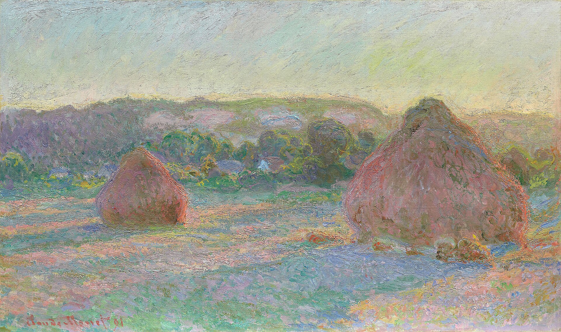
In 1890 and 1891 Monet painted the wheat stacks in a field a few minutes from his house at Giverny, returning to the same shapes at different hours and in different weather. Six of those canvases are in the Art Institute of Chicago. That makes it possible to compare not two subjects but one subject twice, with everything except the season held still: same field, same stacks, same painter, same distance, same box of colours.
We measured four regions in each canvas: a strip of sky across the top, the band of trees at the horizon, the foreground field, and the body of the large stack. The measure is simple, the red channel minus the blue channel, which is a serviceable proxy for whether a passage leans warm or cool. Positive means warm.
Sky: minus 3.9 in late summer, plus 1.6 in autumn. Almost no movement. Treeline: plus 22.4, then plus 10.7. The distance gets cooler , not warmer. Foreground field: plus 1.0, then plus 18.2. A swing of seventeen points. The large stack: plus 36.9, then plus 47.6.
The sky is not the variable. The field is. Between the two canvases the ground moves from neutral to distinctly warm while the sky stays where it was, and the horizon actually goes bluer as thicker air pushes the far trees back. Whatever the season is doing, it is doing it at ground level.
The same square metre, close up
Crop the identical patch out of both canvases, the foot of the large stack and the field running away from it, and enlarge it. This is where the argument stops being a table of numbers.
In the summer detail the field is blue. Not blue-ish: in the lower strip of this crop, 26.5 per cent of the surface sits in the blue and violet band and only 13.5 per cent in the rose and red. The stubble is drawn in short chopped strokes running in three or four directions, each one a separate decision, with the canvas breathing between them. The stack sits on that cool ground as a warm object, and the contrast between them is the subject.
In the autumn detail the blue is gone. Six tenths of one per cent of that same strip is still blue or violet, against 37.2 per cent rose and red. The handling has changed with it: the strokes are longer, dragged more horizontally, and the paint has become a continuous crust rather than a mesh of separate marks. The stack and the field are now the same temperature, plus 47.6 against plus 18.6, and the picture has lost the contrast that organised the summer version. It has to be organised by something else, and Monet organises it by value, the dark mass of the stack against a pale field, and by the one surviving cold note along the treeline.
Why the warmth moves
The mechanism is not mysterious once the numbers point at the ground. Any shadow is lit by whatever the sky and the surroundings bounce into it. In high summer, with a high sun and a large area of clear sky, the dominant fill light is skylight, which is blue, and shadows go blue. That is the physical basis of the whole Impressionist habit of painting violet shadows on a green field. It is not a stylistic tic; it is a measurement.
By late October two things have changed. The sky is more often a diffuser than a source, an even grey ceiling with no strong directional beam and no strong blue. And the ground under everything has turned into an enormous warm reflector: dry stubble, fallen leaves, bare soil, all of it ochre. The secondary light in the landscape stops being blue and becomes orange. The shadow, which is nothing but secondary light, warms up accordingly.
Measured across the whole set, this reversal is the most consistent thing we found. In Boudin's summer sky study the darkest fifth of the picture is 24.8 points cooler than neutral and the lightest fifth is 11.4 points warmer: a gap of 36 points in the textbook direction. In Lhermitte's October river the relationship is inverted, the shadows warmer than the lights by 45 points. Levitan's Golden Autumn: inverted by 20. Monet's own two canvases move from a gap of 0.4 to a gap of 7.6 in the same direction.
Summer keeps its warmth in the light and its coolness in the shadow. Autumn does the opposite. The season is not a change of colour, it is a change of where the colour lives.
Against the word muted
Autumn is habitually called muted, and the paintings disagree. Mean saturation in Monet's late summer canvas is 0.169; in the autumn canvas it is 0.204. At the ninetieth percentile, that is, in the most intense tenth of the surface, the figures are 0.312 and 0.372. The autumn picture is the more saturated of the two by roughly a fifth.
What actually narrows is the hue range, not the intensity. The palette closes toward a smaller arc of the colour wheel and then works harder inside it. Jean-Charles Cazin's October Day is the limit case: measured across its whole surface it contains no green at all, 54 per cent yellow and ochre, 46 per cent orange and red, and a warm bias of 61 points, five times Monet's late summer. It is not a quiet picture. It is a loud picture made of three colours.
Which colours survive the closing is worth noticing. Ochre, raw and burnt sienna, umber, red earth. These are the oldest pigments in use anywhere, ground out of the ground, in the caves tens of thousands of years before anyone had a blue that did not cost more than the panel it went on. Autumn returns painting to its first palette, and paints the season in the colours of the material it is depicting.
Where the yellow comes from, and why the red behaves differently
A green leaf is not green because green has been added. It is green because chlorophyll is dominant, and the carotenoids and xanthophylls that give the yellows and yellow-oranges have been sitting inside the leaf all summer, masked. When the tree begins withdrawing nutrients and chlorophyll production stops, the mask lifts and the yellow is revealed. It arrives by subtraction.
The reds are a different event. In many species anthocyanins are manufactured in autumn, made new in the leaf as sugars are trapped there by the closing of the vascular channels. So the two halves of the autumn palette come from opposite processes, one an unmasking and one a production, and this shows up in how they distribute. The yellows spread evenly through a whole mass of foliage, because they were already everywhere. The reds appear in patches: on particular trees, on the sunlit side, in the crown before the base. A painter who spreads red evenly through a wood has painted something that does not happen.
Millet's picture contains the other autumn inversion, the one that follows from the first. Under a diffusing overcast, a field of cut stubble becomes the brightest surface in view and the sky above it goes dull. In a summer landscape this is close to impossible, because the sky is the source. Here the source has been spread out and the ground is doing the reflecting, so the picture is effectively lit from below. It also solves an old compositional problem: the figure no longer has to compete with a brilliant sky and can be drawn as a dark shape on a bright ground.
Pastel, and why this season belongs to it
If one medium owns the three weeks of the turn, it is pastel, and the reason is optical rather than sentimental. Oil paint is pigment suspended in a film: light enters the film, is partly absorbed inside it, and comes back out having been changed on the way. That is what gives oil its depth and its capacity to be glazed. Pastel is pigment with almost no binder, a little gum, pressed into a stick and then abraded onto a toothed surface. It sits there as loose grains with air between them. Light does not travel through a medium; it scatters off the surfaces of dry particles and returns immediately, in all directions, with almost no specular component.
That is, in the exact optical sense, the same behaviour as an overcast autumn sky, which is a diffuser rather than a source. Pastel does not imitate the light of the season. It reproduces its physics.
Three pastels make the case better than any argument, because the medium is held constant and only the season moves. All three are drawn on toned paper, which is the second half of the story.
Boudin is the summer state of affairs in its purest form. He made hundreds of these sky studies on the Normandy coast, dated and timed on the sheet like meteorological records, and Corot called him the king of skies for it. What the measurement finds is exactly the summer signature: brilliant lights, and shadows filled with blue from an enormous open sky. The grey of the paper is doing the work of the middle tone, and the white chalk is spent only on the cloud tops.
Twachtman shows the second thing pastel can do that oil cannot. Almost nothing here is drawn. The tan of the support is the dry grass, the light and the season all at once, and the pastel is spent only on what departs from it: the dark trees at the left, the blue-violet shadows raking across the middle distance, a few strokes of white cloud, some surviving green. The artist chose the colour of the light before making a single mark, and then made as few marks as possible. In oil that ground would have vanished under the picture.
And Lhermitte is the autumn state, in the same medium, on the same kind of toned sheet. Yellow poplars, a bank of ochre mud, a cold river holding the last blue in the picture, and shadows that are the warmest passages on the sheet by a distance of 45 points. Put the Boudin and the Lhermitte side by side and the entire argument of this piece is visible in two objects made of the same dust.
There is one more consequence of the medium worth stating, because it explains why pastel suits a transition specifically. A pastel cannot be repaired the way an oil can. There is no glaze, no scumble over a dried layer, no lifting with turpentine, no painting out. A passage from one colour to the next has to be built by laying dust over dust and by stumping, that is, by rubbing the pigment into the tooth of the paper with a rolled paper stub until one hue hands over to the next. The transition is made by abrasion. For a subject whose whole character is a gradual handover between two palettes, the method and the motif are the same gesture.
The sheets have had their own autumn
Read the catalogue descriptions of nineteenth-century pastels to the end and something quietly remarkable appears. The Art Institute records Alfred Sisley's A Corner of Moret-sur-Loing, 1895, as pastel with stumping on grey wove paper with blue fibers, discoloured to tan. Mary Cassatt's Sleepy Nicolle, about 1900: blue-grey wove paper, faded to tan. Odilon Redon's Flower Clouds, about 1903: blue-grey wove paper with multi-coloured fibres, altered to tan.
The cool half of each of those pictures, the part the artist chose precisely because it would carry the coldness of the light, is the part that has gone. Paper yellows: lignin oxidises, sizing degrades, and blue dyes are among the least lightfast materials in the room. So these works have themselves travelled from summer to autumn, in the same direction as their subject, over a century, in storage.
This is not a footnote for conservators. It changes the reading. A Sisley pastel that today looks like a warm October afternoon may have been drawn as a cold one, its greys held up by a blue support that no longer exists. Anyone measuring a faded pastel is measuring two events at once: the light the artist saw, and the hundred and twenty years since.
Autumn begins on the seventh of August
Everything above assumes that a season is a lighting condition, something you detect by looking at the sky and the ground. One tradition organises it the other way round, and holding the two side by side is the fastest way to see that the European nineteenth century made a choice rather than a discovery.
In the Japanese calendar inherited from China, the year is divided into twenty-four solar terms, and the one called risshu, the beginning of autumn, falls around the seventh or eighth of August. Not the equinox, not the first cold night: the seventh of August, when the heat in Kyoto is at its worst. Autumn is declared. From that date onward a poem that mentions cicadas, dew, geese or the moon is an autumn poem, whatever the thermometer says, and a painter who signs a screen of grasses in September is working inside a season that officially began five weeks earlier.
The terms are then subdivided again, into seventy-two ko of roughly five days each, every one named after a single natural event. The Japanese set was revised into its familiar form by the court astronomer Shibukawa Shunkai in the seventeenth century. The three that make up risshu are, in order: cool winds arrive, evening cicadas sing, thick fog descends. A month later, under white dew, comes the unit called dew glistens white on the grass.
This deserves attention from anyone who has just read four thousand words of measurements. It is the same instinct, an attempt to resolve the turn at the finest grain available, but the instrument is a name rather than a number, and the resolution is five days rather than a hue percentage. The tradition that supposedly does not measure the season has divided it into units so short that most European calendars have no word for them at all.
The season is a plant, not a light
If autumn is a date rather than a condition, then a picture cannot announce it by the angle of the sun, and it does not try to. It announces it with a plant. The Man'yoshu, the eighth-century anthology, fixes the seven grasses of autumn in a pair of poems by Yamanoue no Okura: bush clover, miscanthus, kudzu, pink, patrinia, boneset, bellflower. For the next twelve hundred years those seven, and above all the miscanthus called susuki, carry the season in poetry, on lacquer, on ceramics and across screens.
This screen is three and a half metres of one plant. There is no ground line, no horizon, no sky, no cast shadow, no hour of the day. Measured, the green pigment covers 2.4 per cent of the surface: the remaining ninety-seven and a half per cent is the prepared paper, doing exactly what Twachtman's tan board does in Connecticut three hundred and sixty years later, except that here it is a settled convention rather than a discovery, and the empty ground has a name and a theory behind it.
Put the two next to each other and the rhyme is almost embarrassing. A Muromachi painter and an American Impressionist arrive at the same solution, that the support should carry the season and the pigment should only mark what departs from it. One got there through a tradition of negative space and the economics of gold leaf, the other by picking up a pastel stick and noticing what happened when he stopped filling the sheet.
The moon rises out of the grass
The other half of the Japanese autumn is not the sun at all. It is the moon. The full moon of the eighth lunar month is the autumn moon, viewed at parties held for the purpose, and the plain called Musashino, west of Edo, is the place-name attached to it: a plain so flat and so thick with susuki that in the poetic formula the moon has nowhere to rise from except the grass itself.
The screen does what the formula says. A silver moon sits low in a field of miscanthus, and there is no horizon behind it, because the ground it would rise from has been replaced by gold leaf. Measured, the gold band reads plus 99.7 on the same warm-cool scale that gave Cazin's extreme European autumn plus 61. Nothing painted from observation in this article comes close to it.
More telling is the direction of travel inside the picture. The gold at the top is plus 99.7, the grass band across the middle is plus 73.3, and the foreground is plus 25.6. The screen gets cooler as it comes forward, which is the exact inverse of Monet's autumn field, where the ground was the warm end and the sky stayed neutral. In Giverny the warmth had moved down into the stubble because that is what October does to a field. Here the warmth is at the top because the top is metal, and metal is warm regardless of the month.
Two cautions on that number. Gold is a specular surface, so a photograph of it records one particular raking light in one gallery, and the figure describes a warm metallic ground rather than a colorimetric fact. And the silver of the moon has tarnished over four centuries, which is why it now reads as a dark grey disc rather than a bright one. As with the faded pastel papers, the object has aged in a direction that changes the reading: the picture was made with a bright moon and now has a dull one.
Light you can wipe onto a block
In the woodblock print the question of where the light comes from has an unusually literal answer. It comes from the printer's cloth. The graded washes in Hiroshige's skies are bokashi: ink is wiped onto the block by hand in a gradient before each impression, so no two sheets in an edition are identical and the entire atmosphere of a print is a manual gesture performed hundreds of times.
Sampled in strips down the sky, the ramp is unmistakably manufactured rather than observed. It runs from a saturated blue at the top, hue 214 with saturation 0.30, through hue 171 at saturation 0.12, to a near-neutral pale at hue 59 and saturation 0.07 by the horizon: one pigment, one wipe, saturation falling smoothly and value rising smoothly. Monet's sky over the stacks does not behave like that. It changes hue as it crosses the canvas, because it was matched to something being looked at.
And the way this sheet says autumn is worth listing, because not one item on the list is a lighting effect. There is a moon, cropped by the eaves so that you register it as a fact rather than a spectacle. There is a line of geese, the standard autumn arrival. There is a room after the party: dishes pushed aside, a lantern, a shadow on the paper screen, the guests gone. The season is a date in the calendar, a bird, a plant and a social occasion, recorded in a print whose light was applied with a rag.
Tosa Mitsuoki's maples close the argument. Measured across the whole surface the screen is 83.5 per cent yellow and ochre, the highest concentration of warm colour anywhere in this set, higher than Cazin, higher than Millet, and yet there is no sun angle in it, no aerial perspective, no cast shadow, nothing that could be called an observation of light. What there is instead is a species, and slips of poetry paper tied to the branches by people who came out to look at the leaves and wrote something down. Momijigari, leaf-hunting, is an outing with a literature attached.
Even the colour vocabulary is codified rather than observed. Traditional Japanese colour names include kuchiba-iro, decayed-leaf colour, a specific brown-yellow with a fixed dye recipe and a fixed place in the wardrobe calendar. A European painter mixes a colour that matches what a leaf is doing this week. A court painter reaches for the colour the season is agreed to have.
Neither system is more accurate. They answer different questions. The European tradition asks what the light is doing right now and builds an instrument, the canvas, sensitive enough to record it. The Japanese tradition asks what season it is according to the calendar and the poems, and then names the plant, the bird and the colour that belong to that answer. The first produces twenty-five wheat stacks in one field. The second produces three and a half metres of a single grass, and a moon with no horizon to rise from.
Where the road ends
The last of the Chicago stacks answers the question the first two open. Measure the snow canvas and the warm bias goes negative, minus 4.3, the only picture in this set whose average is cooler than neutral. Blue and violet take a quarter of the surface. Green is gone to a tenth of one per cent. The orange and red band survives at 15.5 per cent, and almost all of it is inside the stack itself.
That is the end of the sequence. The warmth withdraws from the field and concentrates in the one built thing standing in it, and the ground hands the light back to the sky. Autumn is the interval in which that handover is visible, which is why it repays a series rather than a single canvas, and why Monet needed twenty-five of them.
Four questions to take outside
Which is brighter, the sky or the ground. Where is the warmth, in the light or in the shadow. How many planes of distance survive, three or two. And is the yellow spread through the mass while the red arrives in patches, which tells you how far the process has gone. The first two will date a landscape painting to within about six weeks, and they work equally well on the street outside.
Method and sources
Colour figures were computed from open-access reproductions, sampled at reduced resolution, with red-minus-blue used as a warm-cool proxy and pixels grouped into hue families reported as a share of surface. Regional figures come from fixed rectangles in each image, described in the text. These are measurements of photographs, not of paint: museum photography is colour-managed but interpretive, and century-old varnish shifts everything slightly warm. They are meant for comparison between images in the same set. Works from the Art Institute of Chicago, the Cleveland Museum of Art and the Metropolitan Museum of Art appear under their open-access programmes; Levitan's Golden Autumn is in the public domain. Medium and support descriptions, including the records of discoloration, are quoted from the holding institutions' own catalogue entries.