What a Room Remembers: Interiors After the Image
Autumn Review
From a reused museum apartment in Helsinki to a red-lit SoHo bar and a timber office beneath the Dutch heath, six projects reveal why the season’s strongest interiors are less concerned with style than with time, atmosphere and use.
Viacheslav Munister · 2026-10-10
An interior arrives online as a finished image: empty, corrected, evenly lit and detached from the hours for which it was designed. The more persuasive the photograph, the easier it becomes to mistake composition for experience. Yet the best rooms of autumn 2026 are interesting precisely where the image fails–where daylight changes a surface, where an old object interrupts a new system, where a floor receives wear, where darkness makes conversation possible, or where a material claim can be tested against the way a building is actually made.
This review brings together six projects across domestic, cultural, workplace and hospitality interiors. They are not a forecast of colours or furniture shapes. Nor do they share a look. A restrained apartment near Versailles, a North Sea penthouse, a temporary museum in Helsinki, a timber office in the Dutch landscape, the renewal of Hotel Kämp and a two-level bar in SoHo belong to different economies and social worlds. What connects them is a more consequential design question: how can an interior make time perceptible?
The season’s strongest rooms do not ask to be consumed at a glance. They construct conditions for attention.
Time enters these projects in several forms. It is historical fabric that must be neither erased nor sentimentalised. It is the future disassembly of a temporary exhibition. It is timber allowed to carry structure rather than imitate warmth. It is a hotel expected to survive intense use without becoming anonymous. It is the half-light of a bar, calibrated not for documentation but for the social permission night can offer. Together, the six projects suggest that contemporary interior design is moving away from the room as a still life and toward the room as an active agreement between matter, climate, memory and behaviour.
1. Versailles: preservation without obedience
In an eighteenth-century house south of Paris, Inès Deschodt and Johanne Le Griffon begin with an apparently familiar brief: make a historic apartment workable for contemporary life while retaining its architectural dignity. The danger is equally familiar. Conservation can become a tasteful freeze, while contrast can become a performance in which every new insertion loudly announces its date. This 135-square-metre pied-à-terre avoids both traps by treating the existing shell as a frame with enough authority to absorb disagreement.
Mouldings and proportions are preserved, but the rooms are not staged as an inventory of period correctness. A deep, low sofa settles into the salon without competing with the fireplace. Dark timber and black metal give weight to the otherwise pale envelope. The most forceful intervention arrives in the kitchen, where Calacatta Viola marble is placed beside stainless steel. Veining and reflectivity do not blend with the old house; they sharpen one another. Marble carries geological excess and domestic ceremony, while steel brings the unemotional precision of the professional kitchen.
The project’s real intelligence is not contrast by itself, but the control of visual temperature. In the living areas, daylight is diffused through curtains and absorbed by dark upholstery. In the kitchen, metal catches and redistributes it. Elsewhere, sapele panelling and an electric-blue carpet create a denser, almost nocturnal register. The home is allowed to have several atmospheres instead of forcing every room into the same photogenic neutrality.
Even the bathroom’s microtopping is less interesting as a fashionable seamless finish than as a pragmatic act: it is applied over existing surfaces, limiting demolition while giving the small room a continuous field. That choice is modest compared with the kitchen’s theatre, but it reveals the project’s method. The new work does not need to dominate every surface. It intervenes where performance, maintenance or spatial emphasis requires it, then recedes.
Review verdict – Strongest move: allowing historic detail and contemporary material intensity to coexist without hierarchy. Risk: the marble-and-steel kitchen can read as an autonomous luxury image. What it changes: preservation becomes a flexible spatial discipline rather than a decorative style.
2. Residence DNB: the sea is not a colour palette
Residence DNB, a duplex penthouse in Knokke-Heist by Britt Van Namen, could easily have turned its North Sea view into a theme. Coastal projects are often reduced to beige textiles, bleached timber and a generalised language of calm. Here, the horizon is treated not as decoration but as a source of changing luminance. The interior remains quiet enough to register the weather, while its materials are substantial enough not to disappear against it.
The rounded stainless-steel kitchen island is the clearest example. Its shape prevents the metal from becoming severe: light moves around the curve, blurring the boundary between object and reflection. Behind it, pale cabinetry and stone shelves are deliberately recessive. Two dark timber stools introduce a warmer contact point at the body. The arrangement looks simple because several kinds of hardness–metal, stone, glass–have been choreographed through radius, texture and distance.
A rammed-earth floor gives the apartment an unusually grounded base, while storage made from scaffolding boards carries evidence of previous use. Green marble and Breccia Rosata appear as concentrated accents rather than an all-over statement. Van Namen has described atmosphere as something produced by textures, proportions, transitions and light. Residence DNB supports that claim because no individual material is asked to supply the whole identity. The experience accumulates across thresholds.
The weakness of many luxury interiors is that tactility is offered as a substitute for social or environmental consequence. A rough wall, handmade tile or reclaimed board becomes a visual alibi. DNB is strongest when it resists that simplification. The reused boards do not make the whole apartment circular, and the rammed-earth surface does not neutralise the embodied cost of extensive glazing and bespoke stone. Yet the project demonstrates a more mature material literacy: provenance, sensory effect and technical performance are allowed to remain different questions.
Review verdict – Strongest move: translating the sea into a changing light condition rather than a decorative theme. Risk: material richness can still be mistaken for environmental responsibility. What it changes: luxury is located in calibrated transitions, not in the number of visible finishes.
3. Eteläranta 6: circularity becomes visible intelligence
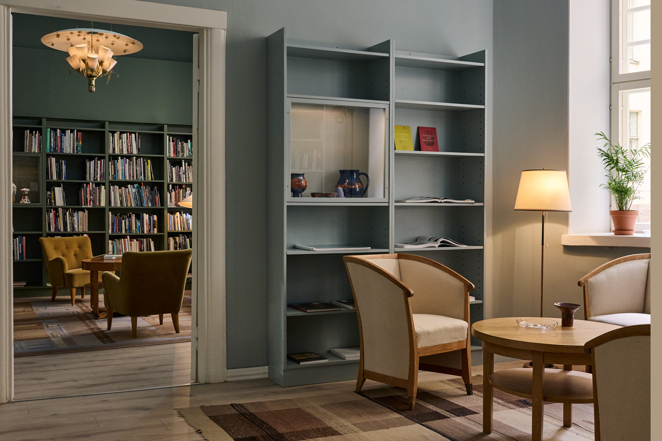
The temporary Architecture & Design Museum at Eteläranta 6 in Helsinki is the most conceptually important project in this selection because it treats reuse as the origin of an aesthetic rather than a compromise applied after design. Studio Joanna Laajisto worked within a Jugend apartment designed by Mauritz Gripenberg in 1904. The museum needed event rooms, a library, workshops and spaces for public work, but its occupation was never meant to justify wasteful permanence.
Almost every decision therefore begins with an inventory: what can remain, what can be borrowed, what can be recovered, and what can later move elsewhere? Reclaimed Ecophon acoustic panels, Ege carpet tiles, a second-hand Kvadrat curtain, salvaged bespoke furniture and objects from the museum’s collection form the project’s material vocabulary. Minimal demolition preserves both embodied carbon and the legibility of the apartment.
The result is not a collage of virtuous leftovers. Colour provides a strong ordering system. Dark green gives the library enclosure and concentration; pale blue-grey allows smaller rooms to receive daylight without losing softness; an acidic olive marks a modest table setting with almost theatrical clarity. Curtains absorb sound and define zones. Old chairs are not romanticised as antiques; they are selected for proportion, repairability and the way their worn materials negotiate public use.
Circular design is often communicated through diagrams because its achievements are difficult to photograph. Eteläranta 6 solves that representational problem by making continuity itself sensuous. Nothing matches in the retail sense, but relationships are precise. Wood tones repeat across objects of different ages. Lamps locate islands of use. Textiles reduce the institutional hardness normally associated with temporary venues. The interior feels complete without pretending to be new.
There is a broader lesson here for cultural interiors. Temporary exhibitions frequently consume vast quantities of sheet material, paint, carpet and custom fabrication in pursuit of a supposedly neutral display. Laajisto demonstrates that limitation can produce a richer public character. Visitors encounter not an abstract museum brand but an assembly of Finnish design histories placed back into use. The museum becomes a live archive: not only a place where design is explained, but a room in which its afterlives can be tested.
Review verdict – Strongest move: turning material inventory into atmosphere. Risk: the cultivated elegance of the result may understate the logistical difficulty of reuse. What it changes: circularity is shown as authorship through selection, maintenance and recombination.
4. Office by Nature: when structure becomes the interior
At Tafelberg in Blaricum, Studio Massimo’s Office by Nature addresses a problem that workplace design often avoids. Corporate interiors are typically conceived after the building shell, then replaced on short cycles as tenants, branding or management fashions change. Here, structure, envelope and interior are designed as one timber system. The project’s environmental argument is therefore architectural before it becomes decorative.
The 1,000-square-metre building uses Red Grandis glulam with spruce cross-laminated timber. Poplar bark gives the exterior a rough, weathering surface, while a green roof extends the surrounding vegetation across the building’s profile. Inside, the pitched timber geometry is not concealed above a suspended ceiling. It defines the rooms, catches daylight from long rooflights and gives shared workspaces a domestic scale without imitating a house.
Milled ventilation slots are integrated into timber surfaces rather than added as a competing technical layer. A spiral stair becomes a compact sculptural hinge between levels. Terrazzo incorporates quarry waste, introducing mineral density where the body needs a durable floor. These are not invisible technologies, but neither are they displayed as eco-gadgets. Performance is absorbed into the spatial language.
The project’s title risks the easy rhetoric of biophilia, a word now attached to almost any room with plants or timber. Office by Nature is more convincing when read structurally. Its achievement is not that workers can see greenery, although they can. It is that the interior’s principal visual order is also the building’s load-bearing and environmental order. The caution is maintenance: exposed timber, planted roofs and bespoke ventilation details demand long-term care. An ecological interior is credible only if its operational life confirms the promise of its photographs.
Review verdict – Strongest move: collapsing structure, servicing and atmosphere into one legible timber system. Risk: the language of ‘nature’ can conceal resource and maintenance questions. What it changes: workplace identity comes from construction rather than applied branding.
5. Hotel Kämp: durability is the real form of luxury
Hotel renovation tests a designer’s ethics of time more severely than a private home. Rooms are used intensely, photographed repeatedly and expected to communicate continuity to guests who may know the building only through reputation. At Helsinki’s Hotel Kämp, founded in 1887, Fyra’s renewal of guestrooms and corridors forms part of a larger expansion that includes Helander House and twenty-two additional rooms, fifteen of them suites.
The project avoids the two standard responses to heritage hospitality. It does not reconstruct a nineteenth-century interior as spectacle, and it does not neutralise the building into international five-star anonymity. References to Finnish cultural life, including Helene Schjerfbeck and Jean Sibelius, appear through artworks, suites and atmosphere rather than themed decoration. Mouldings, ceramic stoves, warm timber, pale textiles and carefully chosen colour establish a layered chronology.
The strongest rooms contain a degree of visual friction. A bright rug sits beneath tailored furniture. A glass pendant gathers light into a dense cloud. Art is not centred merely to complete a wall. These gestures prevent heritage from becoming beige reassurance. They also recognise that a hotel interior must be understood in episodes: arrival, unpacking, working, eating, sleeping, waking. Each requires a different light level and a different relationship between exposure and enclosure.
Durability is the project’s unresolved but essential criterion. Luxury hotels frequently replace surfaces before they are physically exhausted because visual freshness is part of the product. Fyra speaks of combining modern technology with longevity; the claim will be proven by repair strategies, replaceable components and whether patina is accepted rather than treated as failure. The most sustainable heritage hotel is not the one that looks historic on opening day, but the one that can absorb thousands of nights without requiring another total image reset.
Review verdict – Strongest move: using Finnish cultural memory as spatial depth rather than literal theme. Risk: hospitality’s cycle of cosmetic renewal can undermine claims of longevity. What it changes: luxury is judged by repair, acoustic comfort and the ability to age, not by immediate novelty.
6. Bar Leone: the design of permission after dark
Bar Leone at 527 Broome Street, designed by BOND, is the selection’s most openly cinematic interior. Opened in September 2026, the 2,400-square-foot venue divides itself vertically into two related but distinct social worlds. The upper level uses sapele, corduroy velvet and red travertine to hold a slower, warmer ‘golden hour’. Downstairs, red velvet wallpaper, vinyl banquettes, lacquer and chrome produce the compressed energy of an Italo-disco.
The project is valuable because it makes lighting perform more than visibility. Light defines distance between strangers, controls how quickly the room can be understood and gives materials a temporal role. Red travertine looks almost liquid under amber sources. Chrome turns each lamp into several reflections. Faces are legible without being exposed. The room offers a calibrated degree of privacy in public–one of nightlife design’s most important and least measurable achievements.
Downstairs, the palette becomes denser and more synthetic. Upholstered chairs are almost bodily in profile. The colour red moves across carpet, walls, leather and light, but variation in sheen prevents monochrome from becoming flat. Custom lighting by Gantri and a scheme developed with Map Studio establish rhythm rather than blanket illumination. Furniture by Spinzi Studio is arranged to permit different forms of occupation: watching, gathering, withdrawing, approaching the bar.
The risk is obvious: a room this controlled can become a backdrop before it becomes a place. Its visual signature is immediately available to social media, and every polished reflection can be framed as content. Yet the plan’s division into two atmospheres gives the bar a resistance that a single iconic room would lack. Guests must choose a tempo. Movement between levels becomes part of the evening. The interior does not merely represent nightlife; it edits its sequence.
Review verdict – Strongest move: treating light as a social boundary and timekeeping device. Risk: the cinematic identity may be consumed faster than the rituals it is meant to host. What it changes: hospitality design is evaluated through permission, pace and acoustic intimacy, not only appearance.
What the six projects say together
Placed side by side, these interiors resist a single seasonal aesthetic. There is no responsible way to call green walls, stainless steel, timber structure, reused furniture or red light ‘the look’ of autumn 2026. Their value lies in different relationships between design and duration. Versailles shows that preservation can accommodate material disagreement. Residence DNB makes climate and horizon active components. Eteläranta 6 turns reuse into a curatorial method. Office by Nature gives construction the work usually assigned to corporate styling. Hotel Kämp asks whether luxury can survive repair. Bar Leone designs the night as a sequence of permissions.
Three criteria emerge. The first is temporal legibility: can a visitor sense what existed before, what has been added and how the room might change? The second is environmental specificity: does light, climate, acoustic behaviour or material sourcing genuinely shape the interior, or is context used only as a narrative? The third is operational truth: will the space remain convincing when people work, spill drinks, move chairs, open curtains, replace damaged parts and return for a second year?
These criteria make interior criticism more demanding than the ranking of images. A beautiful photograph remains useful evidence, but it is incomplete evidence. It cannot show glare at noon, the noise of a full dining room, the maintenance regime of a bark facade, the ease of repairing a hotel headboard or the labour required to catalogue reused exhibition furniture. Design culture needs images, but it also needs plans, specifications, post-occupancy accounts and honest statements about what was retained, removed and newly made.
A room matters when its atmosphere is not an effect placed over use, but the perceptible form of how it is built, maintained and shared.
What survives the photograph
The most memorable interiors of this autumn are not those with the most recognisable palette. They are the ones in which atmosphere can be traced back to decisions. A shadow exists because a light source has been located with care. A calm room is calm because circulation, acoustics and storage have been resolved. An old chair remains because someone accepted the work of repair. A timber ceiling is warm because it carries load, filters air and measures daylight–not because a timber veneer was applied at the end.
That distinction separates style from authorship. Style can be copied quickly; an operating logic cannot. The six projects are not beyond criticism, and none should be treated as a universal model. Their budgets, users and regulatory conditions differ too radically. But each offers a precise proposition about what an interior can do. The room is no longer a container filled with taste. It is an environmental and social instrument, tuned through material, light, memory and use.
Autumn is often described through retreat: shorter days, enclosed rooms, heavier surfaces. These projects suggest a more useful interpretation. The season makes us notice interior conditions again. It reveals which spaces can hold changing light, which histories have been allowed to remain active, which materials promise more than an image and which forms of comfort depend on someone else’s invisibility. The rooms that matter now are not simply beautiful places to enter. They are places that make the terms of entry worth examining.
Project index and sources
Research and text by Viacheslav Munister for EPRIS Journal. The review is based on official studio documentation and published project information. Image captions identify the credited photographer where supplied by the source; Eteläranta 6 images are credited courtesy Studio Joanna Laajisto.