Against the Right Angle
Essay
Five buildings that talked their way out of the grid – and the software, the metal, the money and the sheer nerve it took to build them.
Viacheslav Munister · 2026-08-02
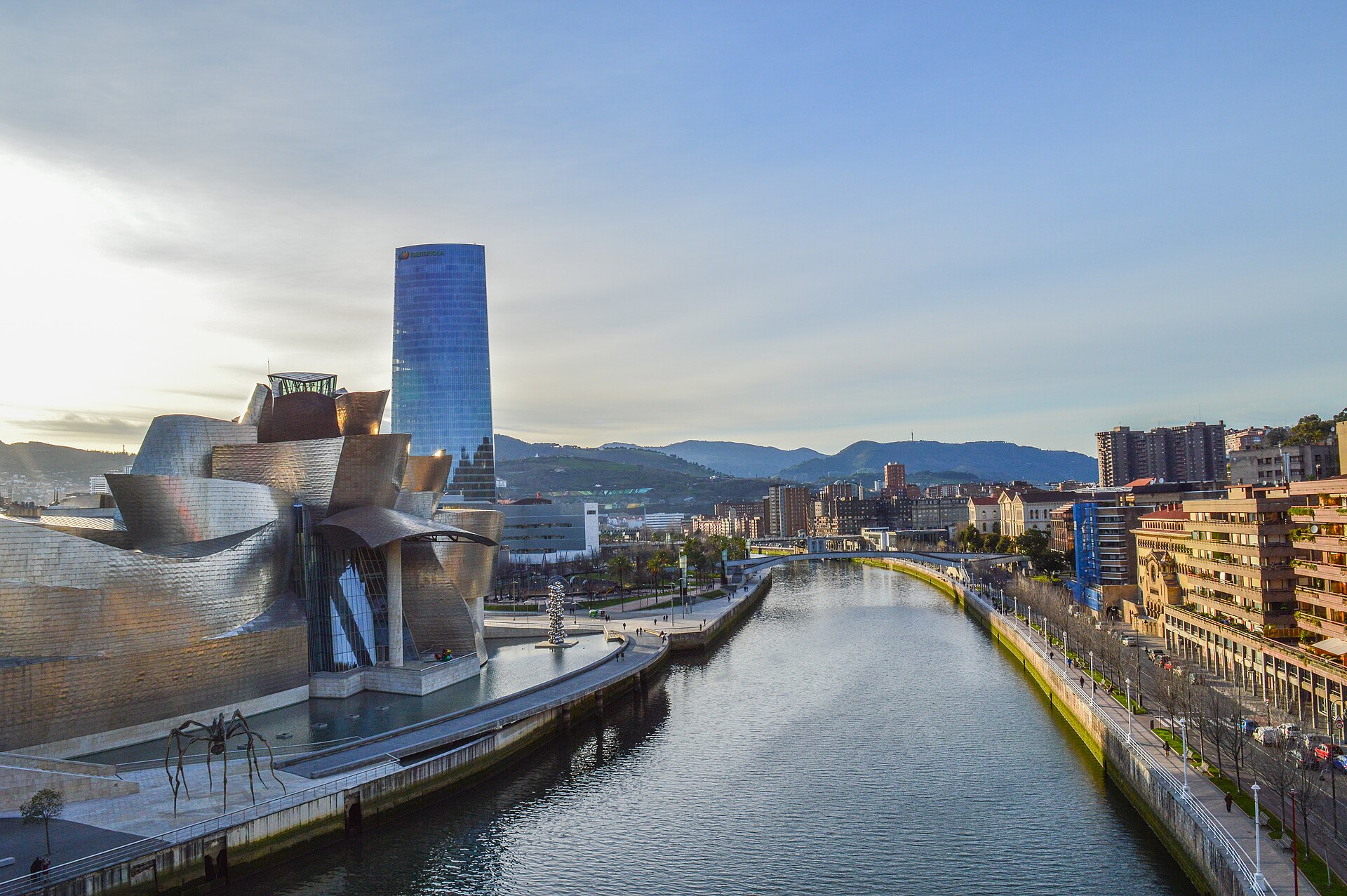
Every architecture student is taught to revere the right angle, and every architecture student eventually notices that nothing outside the studio is at ninety degrees. Not the coastline, not the ribcage, not the river, not the way people cross a square – they cut the corner, always, which is why the grass on any campus dies diagonally before it dies anywhere else. The grid is not nature. The grid is a filing system. It won because it was cheap to draw with a T-square, cheap to price by the square metre, and cheap to defend in a planning meeting to a committee that had already stopped listening.
So for a century the curve was something you paid extra for and then justified in writing. Curved wall, custom formwork, a contractor breathing through his teeth, and a quantity surveyor wearing the expression of a man reading a hospital bill in a foreign currency. You were allowed exactly one – in the lobby, where visitors would see it and investors would feel it – and then the building went back to being a filing cabinet with windows, a nice reception desk and a coffee machine nobody had specified.
What ended the arrangement was not a manifesto. Manifestos had been available since 1919 and had built almost nothing. It was arithmetic. Between roughly 1990 and 2015, software borrowed from people who make aeroplanes and cars got good enough to describe a doubly curved surface precisely enough to cut it, cost it, insure it and – the unglamorous miracle at the bottom of this entire story – get a fabricator in a shed outside Zaragoza to produce panel 3,417 so that it meets panel 3,418 on a wet Tuesday in October, with a tolerance measured in millimetres and a foreman who does not care about your concept.
The five buildings below all sit inside that window, and they are habitually filed together under words designed to prevent thought: blob, parametric, organic, iconic – the last one deployed almost exclusively by people who want your signature on something. Look closer and they agree on nothing at all. One is a sculpture that happens to contain a museum. One is a landscape doing an impression of a building. One is a shopping centre having an existential crisis at 330,000 square metres. One is a traffic diagram that grew a skin and a Mercedes badge. One is a snowdrift with excellent acoustics and a free roof.
In every case the shape is the argument, not the wrapping paper. The interesting work – the part that survives the photograph – is establishing what each one is arguing for, who paid for the argument, and what it cost after the ribbon was cut. Because all five arrived with an invoice, and only some of them were worth settling.
01 · Frank Gehry Guggenheim Museum Bilbao
Bilbao · opened 18 October 1997 · the sculpture that ate a city’s reputation
Reconstruct the pitch meeting for a moment. It is the early nineties. Bilbao is a port city with dying shipyards, a poisoned river, serious unemployment and a security situation that kept tourism reliably elsewhere. The Basque authorities propose that the remedy is a franchise of a New York museum, built on the derelict docks, designed by a Californian known internationally for chain-link fencing and an unresolved personal thing about fish. And they will pay for it themselves: eighty-nine million dollars.
The commission itself was decided in three weeks. Guggenheim director Thomas Krens shortlisted three architects – Gehry, Arata Isozaki, Coop Himmelblau – handed each ten thousand dollars, and asked for a concept. Isozaki sent sketches of an elliptical, four-storey block. Coop Himmelblau proposed transparent cubes. Gehry sent something that looked like nothing anyone had asked for, and got the job.
By every reasonable standard this should have ended in a public inquiry. Instead it became the most imitated urban gesture of the century, and the taxes it generated covered the construction bill inside three years.
$89m construction cost €100m in taxes, first three years 4 million visitors, first three years 1.3 million visitors in 2025
Read those four figures in sequence, because they are the entire reason every mayor on earth has since wanted a strange building. Within three years the museum had generated an estimated €500 million of economic activity and about €100 million in taxes – the building paid for itself and then started sending money home. Almost no piece of public architecture in history can produce that receipt. It is why the phrase “the Bilbao effect” exists and why it has been misapplied roughly once a month ever since.
The design myth – Gehry crumples paper, hands it to an engineer, engineer weeps – gets the direction of travel exactly backwards. His office did work obsessively in physical models. The reason those models became a building rather than a lawsuit is CATIA, software written for the aerospace industry and adapted by his team to digitise the model and hand fabricators surfaces they could genuinely produce. Every panel is a numbered, tolerance-checked object with somewhere to be. The building looks like it was assembled during an argument. It is in fact among the most disciplined objects of its decade: a jazz solo that took nine months to write out in full.
It looks improvised. It is the most disciplined thing on the river.
Then there is the skin, which is the finest story in twentieth-century cladding and almost nobody tells it properly. Gehry originally intended stainless steel. What stands there is 33,000 titanium sheets, four-tenths of a millimetre thick, sixty tonnes in total – titanium being an aerospace metal nobody had ever used on a building at that scale, for the excellent reason that it costs a fortune.
Except that in the early 1990s, briefly, it didn’t. The Soviet Union had built the Alfa-class attack submarine with a titanium hull; when Russia decommissioned the last of them, the metal flooded the world market and the price collapsed, undercutting stainless steel at precisely the moment Gehry was choosing a material. Which means the most photographed building of the late twentieth century is wrapped in decommissioned Cold War submarine stock. That shimmer over the Nervión is the peace dividend, rolled to 0.4 mm and bolted to a museum. No architectural historian would have dared invent it.
What Bilbao actually proved is more qualified than the export edition admits. The city also rebuilt its metro, cleaned the river, moved port functions downstream and ran a long, dull, properly funded regional plan into which the museum was inserted as the photogenic component. Cities that ordered the sculpture without the accompanying twenty years of work received a sculpture. Several received a very expensive empty sculpture – a lesson available free of charge and almost never taken.
My favourite thing about the building is the doorman. Guarding the entrance is Jeff Koons’s Puppy: a twelve-metre West Highland terrier upholstered in live flowering plants, watered and gardened continuously so that it never goes bald. A titanium cathedral of the international avant-garde, defended by an enormous dog made of petunias. Bilbao understood the thing its imitators never did – the whole enterprise works far better when it declines to take itself entirely seriously.
02 · Zaha Hadid Architects Heydar Aliyev Center
Baku · opened 10 May 2012 · the floor that ran away up the wall
Zaha Hadid spent the first two decades of her fame as the most celebrated architect alive with almost nothing standing. She won Hong Kong’s Peak competition in 1983 with paintings that looked like shattered glass caught in flight; unbuilt. She won Cardiff Bay Opera House in the mid-nineties and watched the funding dissolve beneath a campaign that had a great deal to say about her being difficult and nothing intelligent to say about the design. For years she was the profession’s designated genius-in-waiting: brilliant, unbuildable, foreign, female – take your pick of which of those the committees were actually objecting to.
Baku is what happens when that imagination is finally handed a hillside and a quarter of a billion dollars.
57,500 m² floor area over eight levels 74 m at the crest of the fold 1,000 seats in the auditorium ~$250m estimated cost
The move is single and absolute: take the ground, lift it, fold it over the auditorium and the library, bring it back down. Plaza, façade and roof are one continuous surface and the building flatly refuses to say where any of them begins. Nothing performs visible heroics – the structure is a space frame concealed behind the white skin, sweating quietly, while the architecture out front maintains that none of this required effort. It is the swan principle, executed across 57,500 square metres.
Then you go inside, which is where the imitators are exposed. Curving the outside is now easy; the tell is whether the geometry survives the front door, or whether you are handed a rectangular room with a suspended ceiling and a fire escape sign. Here the auditorium is carved from identical logic – oak flowing from balcony to ceiling with no joint anywhere confessing that several different trades were involved. Hadid had been painting rooms like this since the 1980s, when they existed only as canvases in group shows. In Baku the painting and the building are the same object, which very few architects in history have got to say.
Now the paragraph the coffee-table books leave out. The building is named for the late president of Azerbaijan and was commissioned under the government of his son, who succeeded him in office. It belongs to a very old genre – the national culture palace as portrait of the ruling family – and it went up in a city being remade at speed, with residents in the wider redevelopment area reporting demolitions and evictions they had not agreed to. When London’s Design Museum gave it Design of the Year in 2014, the prize arrived with a public argument attached, and the argument was not about the roof.
The swan-neck logic even extends to comfort. Tucked inside the folds are enclosed winter gardens several storeys tall, planted with real trees under glass, so the white curves have somewhere warm and green to land. It is an odd thing to grow indoors in a city built on oil rather than water – and it works precisely because nothing about the building apologises for the extravagance.
Both things are true simultaneously, and the discomfort is the honest response rather than a failure of criticism. It is a masterpiece of surface geometry, probably the purest built expression of everything Hadid spent thirty years drawing. It is also a monument financed by an oil state to the father of its sitting president. A magazine that prints only the first sentence isn’t publishing criticism, it is publishing a brochure – and the building is strong enough to survive being described accurately, which is more than most monuments manage.
03 · Zaha Hadid Architects Galaxy SOHO
Beijing · completed 2012 · four moons over the second ring road
Same office, same year, entirely different client: SOHO China, the developer run by Zhang Xin, which buys architecture the way other people buy watches – visibly, expensively, and with a clear understanding of what the signature does for resale. The brief was offices and retail on a major artery in central Beijing. The answer was four rounded volumes fused by bridges at several levels: 330,000 square metres across eighteen floors, with the space between them shaped into flowing courtyards instead of the customary windswept nothing developers leave between towers.
330,000 m² floor area – near six Heydar Aliyev Centers 18 floors 67 m height 4 fused volumes, bridged at several levels
The interiors are the genuine achievement and also the most quietly sinister thing in this essay. Balconies sweep past one another in unbroken bands; nothing squares off; the eye is never handed a corner where it can stop and rest. Stand on the third level and your gaze slides around the atrium like water going round a bath, and your feet follow, because that is what bodies do when the geometry keeps moving. It is genuinely beautiful. It is also, in retail terms, a machine engineered to stop you standing still long enough to decide you would rather go home.
Which brings us to the fight, and it was a real one. In 2013, when the building was nominated for the RIBA’s Lubetkin Prize, the Beijing Cultural Heritage Protection Centre publicly objected, arguing that the development had “caused great damage to the preservation of the old Beijing streetscape, the original urban plan, the traditional hutong and courtyard houses, the landscape formation, and the style and colour scheme of Beijing’s unique vernacular architecture.” That is not a complaint about taste. It is a complaint about manners – a heritage body informing an international jury that the object under celebration had bulldozed the argument rather than won it.
And it lands, because a continuous, self-resolving geometry is superbly equipped to ignore whatever it happens to stand beside. A building made entirely of curves has no edges with which to meet anybody. It does not argue with the street; it declines to concede that the street was speaking. You can admire the object and still grant the point – I do both – and then notice the detail that settles it: everything generous about Galaxy SOHO faces inward. The courtyards are lovely, and they are private. That is an accurate description of a great deal of twenty-first-century development, and it is not a compliment.
None of which stopped Galaxy SOHO winning the RIBA International Award that same year – the letter and the trophy arrived within months of each other. International juries and municipal heritage bodies were, and still are, answering two entirely different questions.
04 · UNStudio Mercedes-Benz Museum
Stuttgart · opened 19 May 2006 · the traffic diagram that grew a skin
Ben van Berkel and Caroline Bos do not begin with a shape. They begin with a problem in movement, draw the problem, and let the form be the consequence – which is why the practice is called UNStudio rather than something with two surnames on the door, and why this is the least self-indulgent building in this essay by a comfortable margin.
UNStudio won the competition for the site in 2001. The museum took five years to build – long enough that half of Stuttgart watched the trefoil rise out of a hole in the ground and had an opinion about it before a single car went on display.
The problem: Mercedes-Benz wants to tell two stories at once. The chronological one – here is 1886, here is the first automobile, keep walking through a century – and the thematic one, in which racing cars live with racing cars and delivery trucks with delivery trucks. Two narratives, one volume, and a visitor who will be justifiably furious if made to walk the first one twice to reach the second.
The answer is a double helix. Two ramps wind down through the building around a central void, never meeting, each carrying one of the stories, with crossings at every level. You ride to the top and descend. You may be a completist and take the century in order, or defect to the trucks whenever the mood strikes, and either way you are always going downhill and never lost. The plan is a cloverleaf of three overlapping circles with the middle removed – and the triangular atrium that produces is, quite deliberately, the shape of a Wankel rotary engine.
A shrine to the engine, in the shape of an engine, organised as a double helix. Corporate architecture is rarely this literate about itself.
16,500 m² of exhibition space 4,800 m² the footprint it stands on 160+ vehicles on display 800,245 visitors in 2023
Hold the first two numbers against each other, because they contain the whole trick: 16,500 square metres of exhibition standing on a footprint of 4,800. The building is nearly three and a half times larger than the ground it occupies, and it manages that not by stacking flat plates but by winding a continuous ramp through the air, so circulation and exhibition are the same square metre used twice. There is no wasted corridor anywhere in it. In a museum full of objects weighing as much as small buildings, it also means the twisting concrete has to span with almost nothing in the way of a bus.
So this is, technically, the hardest object in the group and the only one whose difficulty is entirely invisible. The showmanship went into the structure and none of it into the photograph, which is presumably why it has never had the magazine career of Bilbao or Baku and – I suspect – exactly how the engineers wanted it. Eight hundred thousand people a year walk down it without once wondering how it stands up. That is not a failure of the architecture. That is the highest compliment the discipline has to give.
05 · MAD Architects Harbin Opera House
Harbin · broke ground 2011, opened 2015 · a snowdrift you can buy tickets for
Ma Yansong worked in Hadid’s office before founding MAD, and the inheritance is legible in every surface. What he added is an argument about where the curves come from. MAD’s recurring claim is shanshui – mountain-water – that the Chinese building tradition is about landscape rather than object, and that architecture should behave like terrain instead of standing on it like a trophy. That is an easy thing to say in an interview and a hard thing to prove in aluminium. Harbin is the proof.
Consider the site. Harbin sits on the Songhua river in a province where winter is a six-month administrative fact, where the great annual festival is built from ice blocks sawn out of that same river, and where the temperature does things that make a Central European feel warmly towards his own miserable January. MAD gave it a low white mound in the wetland, clad entirely in white aluminium and read explicitly as a drift – a building at ease with snow because it is already shaped like snow. There are 470 parking spaces underneath it, because terrain is a metaphor and this is still China in 2015.
MAD won the project the ordinary way, for once: an open international competition in 2010, for a masterplan covering roughly 180 hectares of wetland along the Songhua – not just the theatre. The opera house is the one building from that plan the world actually looks at, but it was never meant to stand alone. It's the punctuation mark on a much longer sentence about the river.
1,600+ seats in the grand theatre 400 seats in the studio theatre ~79,000 m² building area 0 tickets required for the roof
That last figure is the one that earns my respect, and it isn’t a joke. A public path is carved into the façade and climbs the outside of the building to a rooftop plaza anyone may walk up: no ticket, no performance, no dress code, nobody at the top checking whether you belong there. An opera house – the single most status-anxious building type in existence, a typology whose entire architectural history consists of staircases designed to be seen ascending – hands its best view to people who will never buy a seat. Every other opera house on earth spends its budget teaching you that the foyer is not for you. This one gives away the roof and asks for nothing.
Then you step inside and the temperature of the architecture changes completely. The main hall is lined in Manchurian ash, milled into surfaces that read as eroded rather than assembled; MAD have described the guiding image as a block of wood hollowed out by hand. After all that arctic aluminium, walking into that warm grain does something almost physical – the pupils adjust, the shoulders drop. Ice outside, hearth inside. It is the oldest move in northern architecture, performed at the scale of a 1,600-seat theatre with a CNC mill.
That division of labour is the thing I keep returning to. Outside, curvature is climate. Inside, curvature is acoustics and warmth. Nowhere in the building is curvature merely curvature-because-it-photographs-well – and after two decades of buildings that were precisely that, the difference is not subtle. It is the difference between a form with a reason and a form with a publicist.
Afterword what the curve costs
Twenty-five years on, the technology won and the rhetoric aged like milk. Nobody says “parametricism” aloud any more without a small apologetic cough. Doubly curved surfaces are ordinary industrial output; a competent mid-size practice can model, cost and procure one before lunch. The revolution succeeded so completely that it stopped being interesting, which is the customary fate of successful revolutions.
What has not become ordinary is keeping the results alive. A panelised skin is thousands of joints, and joints are where water goes to work. Sealant has a service life measured in years, not centuries, and 33,000 panels means 33,000 opportunities to be wrong. Masonry fails slowly and legibly – a stain, a crack, a conversation with a mason. A curved composite skin fails invisibly, then suddenly, then expensively. That invoice never appears next to the renderings, and it is the most reliable omission in architectural publishing.
Stone ages in public. Cladding just quietly stops being waterproof.
The second bill is urban, and much larger. A continuous surface is a closed argument: it resolves internally and leaves the street almost nothing to hold on to. Bilbao gets away with it by anchoring a waterfront that had nothing else and repaying its own construction cost in tax within three years. Harbin gets away with it by handing over the roof. Galaxy SOHO – on the evidence of the neighbourhood it landed in and the objection its own heritage body filed in public – does not. Curvature is not inherently generous or hostile. The only question that has ever mattered is whether the geometry left anywhere for the city to touch it.
So, a bet on which of these five reaches 2100 with its reputation intact. Stuttgart, because two stories genuinely needed to share one volume and a helix is the honest answer – the only building here whose shape could not be exchanged for a different one. Harbin, because a free public roof in a city that cold is a gift rather than a gesture. Bilbao survives on its receipts and its dog. The other two are magnificent, and magnificence, as any facilities manager will tell you, arrives with a maintenance schedule and a sealant contractor on speed dial.
None of which is an argument for returning to the filing cabinet. It is an argument for asking the question almost nobody asked between 1997 and 2015, in the euphoria of discovering that the software would let you draw anything at all: what is the curve for? Answer it honestly and you get Harbin, where the shape is the weather and the roof belongs to everybody. Fail to, and you get a spectacular photograph, a leak on the third floor, and a building that was better before it was finished.
Sources Guggenheim Museum Bilbao – the museum on its own building: areas, galleries and the titanium skin – guggenheim-bilbao.eus Association for Project Management – the project economics, and why titanium was briefly cheaper than steel – apm.org.uk ArchDaily – Heydar Aliyev Center – drawings, structure and project data – archdaily.com Dezeen – the open letter from Beijing’s heritage body over the Lubetkin nomination, 2013 – dezeen.com UNStudio – Mercedes-Benz Museum – the trefoil plan and double-helix circulation, from the architects – unstudio.com MAD Architects – Harbin Opera House – building area, seating and the public rooftop route – i-mad.com Photographs: freely licensed via Wikimedia Commons, each credited in its caption.